A new card style
Old

New
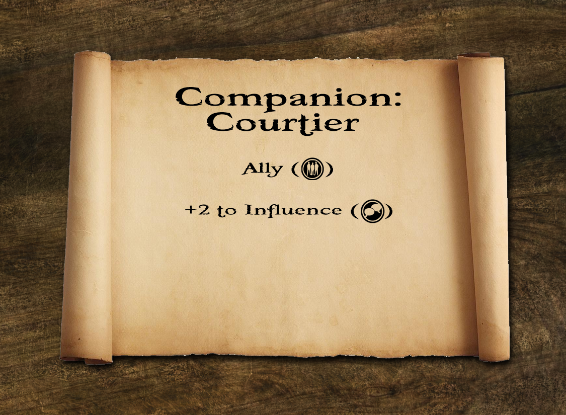
With this in mind I'm probably going to be changing the card layout a bit. The first batch of cards that I'm looking at changing are the reward cards, because these now have an additional effect within the game (they help escalate things so that it's possible for the town's criminals to win, and thus for all of the town guards to lose). This comes through the number of the lower centre of the card.
As you see in the illustrations above, I'm also thinking of adding a bit of flavour text to the cards, to give a bit more thematic atmosphere to the game. Nothing too specific or dramatic, just enough to give the game a bit of tone and context.
.png)

Comments